Re-branding
PROJEKT PRODUKT
-PROJEKT PRODUKT is a brand based on the strong incorporation of the optician's philosophy and the designer's sensibility,
which are the two major axes of the brand identity.
We connect, mediate, and combine the two different objects in a way that they interact with one another.
Projects and products in which the optician's philosophy and the designer's sensibility are harmonized, personalities that cannot be universalized,
the encounters of these people unique in themselves, the mediation of perspectives towards the world
and the places that are seen, and poetic and extraordinary moments in our plain everyday life.
These are the keywords that define the role of PROJEKT PRODUKT and the reason why we exist, and the way of life we dream of.
Intellectual exclusivity and warm minimalist sensibility are the core of our rebranding approach.
A moderate layout and fonts with a sense of
verticality adds to the intellectual exclusivity and the ivory color emphasizes the warm minimalist sensibility.
We hope that our new look will invite you to experience a quiet, poetic, yet a slightly extra-ordinary daily life.
Logo type
The logotype developed from the basic shapes of circles and straight lines represent the warmth inherent in the brand value of PROJEKT PRODUKT, which is committed to delivering the essence of eyewear to our customers. The form with emphasis on the upper axis and the combination of letters of varying widths communicate sophisticated nuances.
Symbol type
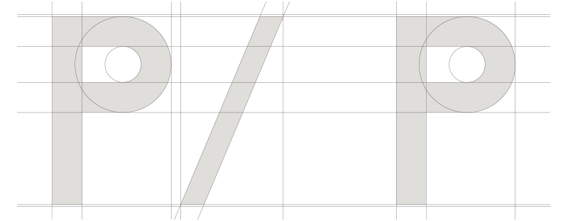
The symbol was created with the 'P' of the wordmark as a motif. The structure of the symbol, in which two Ps are related with a slash (/) between them, represents the unique brand identity of PROJEKT PRODUKT that flexibly crosses and combines two different values. The vertical and geometric shape of the P letter expresses the concrete philosophy of the optician, and the flexible spacing between the two Ps symbolizes the products of the designer's sensibility.
Typography
ABCDEFGHIJKLM
NOPQRST
UVWXYZ
PP Sans is an English-only variable font providing various formats from the thinnest Light to the thickest Bold. PP Sans is characterized by the emphasis on the geometric features of straight lines and circles and emphasis on the upper central axis. The new design was intended to give more comfort to eyes while maintaining a sophisticated impression through the adjustment of the visual balance of the existing logotype. The geometric features and the emphasis on the upper central axis are particularly evident in the capital letters A, G, and Q. Notably, the capital letter A, evoking the image of the sharp tip of a pencil used by an optician and an designer, represents the unique sensibility of PROJEKT PRODUKT.